
Navigation Button Settings
These settings allow you to customize the carousel navigation buttons with arrows, text, or both. You can position them in various locations and adjust their alignment and design, including responsive settings for different devices.
Navigation Buttons Type
This example demonstrates the three available navigation button types: Arrows Only, Text Only, and Both Arrows & Text.
Arrows Only:
Text Only:
Both Arrows & Text:
Navigation Buttons Location
This example demonstrates how navigation buttons can be positioned in different locations, with multiple options available in the dropdown selector.
Sides:
Sides Inset:
Top Left:
Top Center:
Top Right:
Bottom Left:
Bottom Center:
Bottom Right:
Audio Module - Example 1
This example demonstrates navigation buttons using the "Text Only" option, positioned at the bottom center. Custom styling includes background color, border radius, box shadow, and updated left and right button text.
Person Module - Example 2
This example demonstrates navigation buttons positioned at the top right, with adjusted text size, no background color, and custom left and right icons.

Sophia
UI Designer
Sophia designs modern and balanced interfaces, ensuring layouts are visually clear while maintaining a smooth and consistent user experience across projects.

Mia
UX Researcher
Mia studies user behavior and feedback, helping teams make better decisions by understanding what users actually need and expect from a product.

Isabella
Frontend Developer
Isabella builds responsive and reliable interfaces, focusing on clean structure and smooth performance to improve how users interact with websites.

Amelia
Graphic Designer
Amelia creates clean and balanced visuals, focusing on details that improve brand identity while keeping designs simple and visually appealing.

Harper
SEO Specialist
Harper works on improving search visibility, helping websites perform better by optimizing content and structure for both users and search engines.
Blog Module(Products Type) - Example 3
This example demonstrates navigation buttons using both arrows and text. The vertical position of the left and right navigation buttons has also been adjusted.

Shirt
This is a simple product.
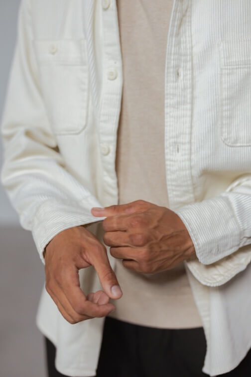
Shirt – Cream
This is a simple product.
Shirt – Cream
This is a simple product.
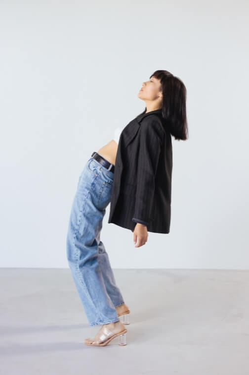
Jacket
This is a simple product.

Shirt – Green
This is a simple product.
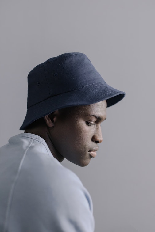
Hat
This is a simple product.